Ryllace
Experience design for a fashion brand launch
- Strategy
- UX
- Design
- Social Media
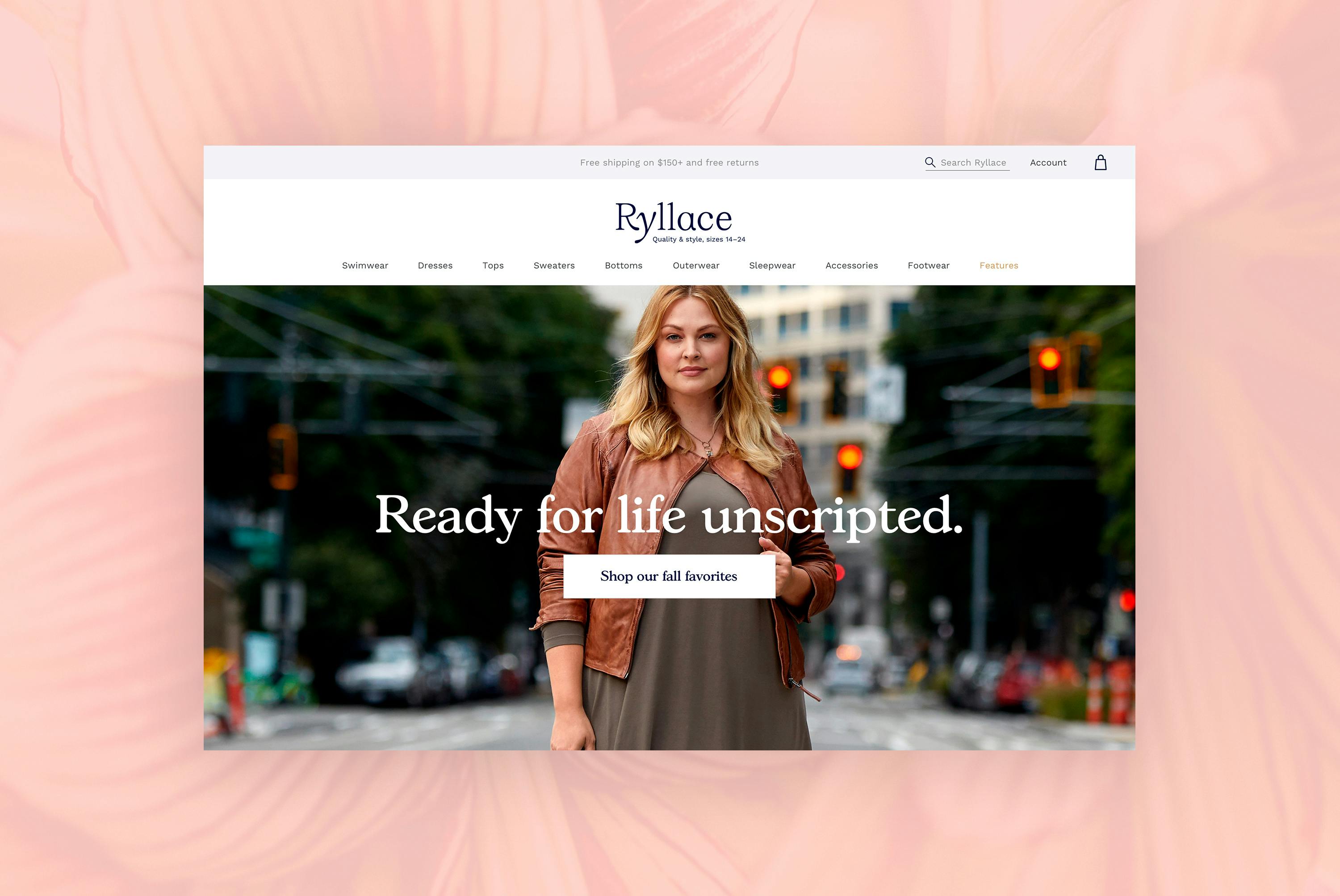
Targeting the underserved plus-size luxury market, Ryllace was created to provide elegant, thoughtfully designed apparel and accessories for women sizes 14–24. Ronik partnered with Cornerstone Brands to bring a distinctive shopping experience and design language to life.
Ryllace was created for women who want to invest in high-quality pieces with exquisite fit and detail, thoughtfully designed for sizes 14 and up. With luxury, sustainable fabrics and a more sophisticated attitude and style than the existing stable of plus-size brands, Ryllace delivered on its promise to make women feel confident and beautiful—to “Look How You Feel”—and needed a digital experience that echoed this mantra.

Working with branding agency BBMG at the ground floor of the brand strategy and audience immersion process, Ronik got to intimately know our new brand and her muse. The brand strategy and the insights we gathered from our customer experience and competitive research uncovered numerous design and CX opportunities for Ryllace. We aimed to raise the bar, to win over our customer with thoughtful experience details like personalization, clear fit details, representations of many body types, and friendly messaging.
As part of the Cornerstone family of brands and digital retailers, Ryllace would share the common ecommerce backend used across the suite of companies. Our constraints and our opportunity lied in designing within the existing infrastructure and ecommerce team’s workflow and resources—within this framework we created a fresh and brand-driven experience.

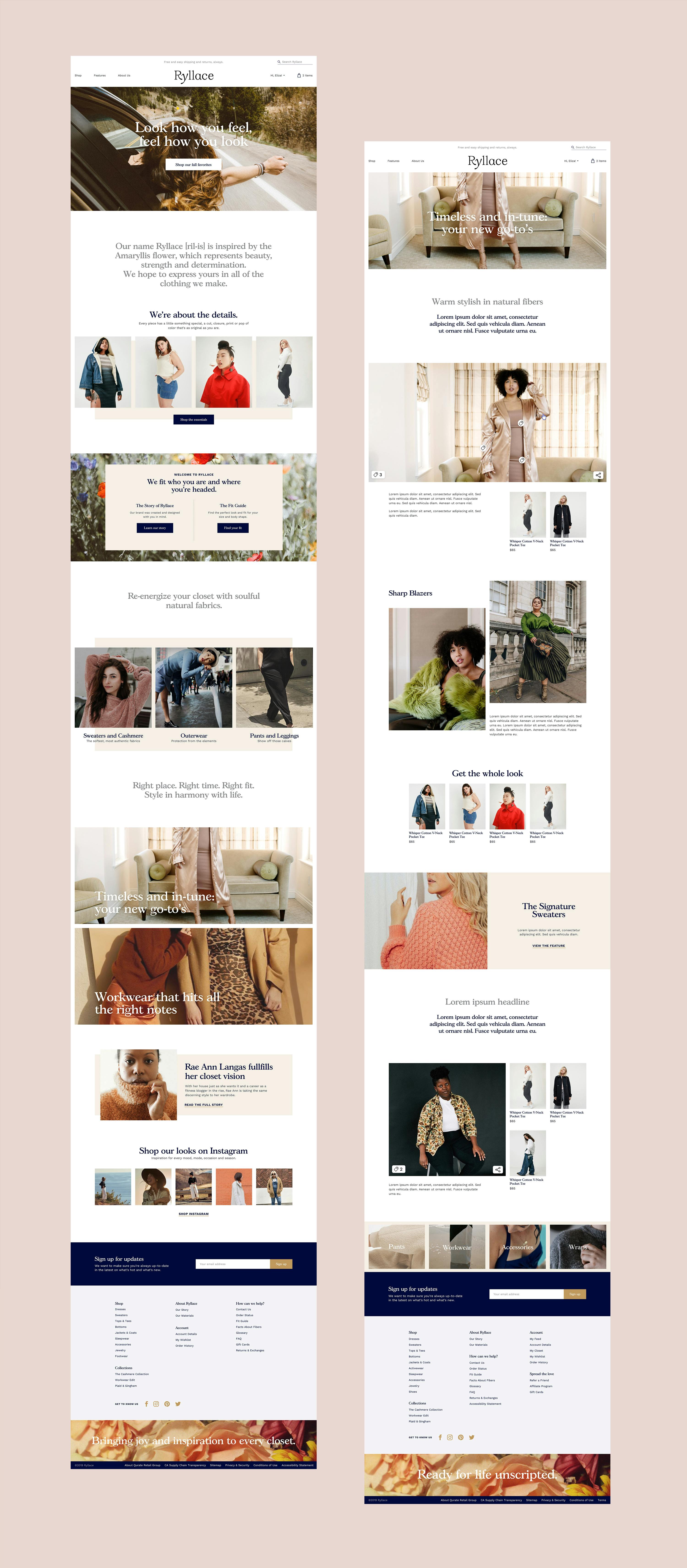
Integrated editorial plays a key role in showcasing looks and offering inspiration. Guest editors and influencers give their personal spin on styling and versatility. “Shop the look” helps customers easily put together an outfit and accessorize from head to toe, and product photography featuring models of multiple body types and sizes gives the shopper the inspiration and confidence to make a purchase.
Bringing a beautiful, inventive Ryllace ecommerce experience to life required out-of-the-box thinking inside an already-defined box. We saw the constraints of the parent company's existing infrastructure as creative inspiration, not limitation. The Ronik team flexed our deep ecommerce, UX, art direction, front-end, and technical skills to fully execute a vision of modern, purposeful beauty, from web to social.
JFK Terminal 4
A digital ecosystem for New York’s largest airport terminal
